Photokina Day 2 – Capture One 8


Introduction

In my recent RAW Converter for X-Trans comparison, it quickly became clear that Capture One 7 offered fairly substantial improvements to image quality for X-Trans sensors over other big all-in-one solutions, Lightroom and Aperture. Yesterday, I received an email to inform me that version 8 of Phase One’s software had been announced. Today I sat with a very knowledgeable member of the Phase One team to talk through the changes to Capture One, and what improvements have been made (or will be made) for Fuji shooters specifically.

Improved Catalogues

Catalogues have been improved, but the big deal is full catalogues can be imported from both Aperture and Lightroom. This is great news for Aperture users looking for a place to turn after Apple’s announcement support would be discontinued, and for Lightroom users looking to get more from their RAFs.

The import process is “pretty smart” according to Phase One. Not only will metadata be preserved (ratings, labels, etc.), but some basic editing will also be pulled into Capture One. This includes things like Exposure, Brightness, and Contrast. Local adjustments of course won’t be preserved, nor will adjustments like Clarity and Definition as they don’t have direct equivalents.

It will be interesting to see just how well this import process works, but it’s nice to know something like this is available.

Tethering

Tethering isn’t supported for Fuji cameras, and there are currently no plans to do so. This is a real shame, but like a lot of items not yet available to Fuji users, if the demand is there, it will happen. If you want tethering in Capture One, let Phase One know. They are listening.

Edge Selection

Edge Selection isn’t supported yet, but they are working on it. Because of the X-Trans sensor, they have to work things like edge selection a little bit differently. It’s good to know it’s in the works.

User Interface

No more crappy menu bar texture! The Phase One dev I talked to didn’t like it either. Overall the UI is much nicer. Cleaner, and without those terrible drop shadows. Very pleased.

Unfortunately full screen mode still doesn’t work the way most people would probably like, but this is another area they are working on, so hopefully we’ll be able to go wide screen and have the panels show always soon.

Shadows and Highlights

These two features have been completely rewritten. When you import a version 7 catalogue, you will be presented with the option to use the new version 8 engine, similar to Lightroom going from 2010 to 2012. Version 8 turns on new algorithms for Shadows and Highlights. The result could be considered as slightly less overall recovery, but the transition between recovered and unrecovered portions of the image are much more natural. This was demonstrated very clearly for me.

Clarity

A “Natural” clarity method joins “Neutral,”“Classic,” and “Punch.” I haven’t had an opportunity to check out the differences yet.

Local Adjustments

Capture One catches up to Lightroom a bit in this area with the addition of White Balance and Noise Reduction local adjustments, but also adds HDR as a new one. This sounds like it could come it really handy.

Aberration Correction

In previous versions of Capture One, fringing could be “over-corrected,” resulting in grey edges where the fringing was. It can now be scaled back for improved correction.

X-Trans Performance

For now, X-Trans rendering is strictly CPU bound. We won’t get to enjoy the GPU optimizations that DSLR owners will. This might not be so bad for owners of computers that lack a discrete GPU, but Phase One are looking into ways of bringing those optimizations to us. Again, the more they hear users want X-Trans support, the more likely they are to provide it, so let them know.

Fortunately, X-Trans CPU performance has increased in many areas from 1.5x all the way up to 2x.

In general there’s been a lot of recoding on the Mac in particular for optimization, and further stability improvements. So far I’ve found 7 to be really solid, but more stability is always welcome.

Image Quality and Camera Support

There have been overall improvements to image quality for X-Trans and preliminary support for the X30 has also been added.

Missing In Action

I asked about a before and after keyboard shortcut, and it’s still missing. They seem content with the creation of Varients as a history and don’t believe that seeing the image as it appeared at import compared to where the image has been taken is very important. This is a matter of opinion, but the real problem is the Browser must be explicitly selected for one to arrow back and forth between two Varients. I watched the dev search for a faster method, but none existed, so I think it may have sunk in a little that they’re still way behind Lightroom, Aperture, and even Nik in this area. Capture One needs a way to see the Before at all times with one keyboard shortcut.

Conclusion

With all these improvements, and Capture One 7’s already superior demosiacing, it’s getting really difficult to not switch over entirely. I intend to do just that once I get home and can download the update.

Photokina Day 2 – X100T Prelim Review

Introduction

I wasn’t even certain they had X100T’s on the show floor at first, but I’ve had a good amount of hands-on time with a couple of them, so much so I feel I can draft up the beginnings of an early review, and I had my X100S and X-T1 at the ready for comparison. This is Fuji vs. Fuji after all.

The X100T is all about usability rather than image quality improvements, and from that angle, I’m very excited to have one of these cameras.

Fuji Fujifilm X100T Photokina.jpg

Grips and Handling

I love the new cross-hatched focus ring. It is much more grippy than the slotted grip on the X100(S). Big improvement. It also looks cool, for whatever that’s worth.

The hand grip isn’t more substantial, but it certainly feels that way as the rest of the camera is a little less deep. It’s not a dangle-from-your-fingers sort of grip, but it helps your fingers feel more like they have a place to rest.

The finish is also exactly the same as opposed to the new rubberized grip found on the X-T1, and the new X30. I have to say I’m slightly disappointed by this as I really like the finish on the X30. It’s less slippery and more sure in the hand. Plus consistency in the materials would make sense.

Fuji Fujifilm X100T Photokina.jpg

Buttons, Dials, Switches

The D-pad buttons are a big improvement in tactile feedback and precision. Placement has also improved with one exception. The View Mode button has been placed above the image review button which is always the top left button on the rear of the camera. I know I’m going to be constantly pressing that button to review images, and wondering what’s going on. Beyond that the placement is great, they are super responsive and every intentional press registers immediately. I thought maybe I’d miss the click-wheel. I don’t. The other nice thing is, despite not having as much room on the back, it doesn’t feel anymore cramped, in fact, it feels roomier. The new button arrangement really helps.

The new exposure compensation dial with ±3EV is nice. Still waiting for exposure bracketing to increase from ±1EV though.

The EVF/OVF switch has gone back to the original X100-style lever since it’s is now bidirectional. More on that in a bit.

LCD

Ah, nice and large. My X100S’s EVF looks puny by comparison now.

OVF

The live parallax refresh works fantastically well. While manually focusing, it moved as quickly as I needed it to. The frame will also dance around the viewfinder window when set to Continuous AF. Not at pro DSLR pace, but it’s definitely quick enough to help track little ones who might be running around.

The OVF/EVF hybrid is nice. I figured at the very least I would want to keep it on for focus confirmation while in AF mode, but in the samples, I can sometimes see what’s actually in front of the viewfinder ghosted behind the inner EVF, especially if your eye isn’t square with the viewfinder. Perhaps this is something that will be improved with firmware as we near the final release, or it could just be something that needs getting used to. It’s an interesting sensation having the EVF overlaid atop the OVF.

Pushing the viewfinder lever one way toggles the hybrid EVF on and off, the other direction switches entirely to EVF mode.

EVF

X-T1 owners will be right at home with this EVF. It’s not as large and seems to lack some contrast compared to the X-T1, but it’s pretty big—larger than the X100S—and refreshes just as quickly as the X-T1’s. Then there’s the rotation of the improved UI.

Autofocus

During my testing, it felt an awful lot like the X-T1, which is what we were expecting. I will be interested to see if it is able to match the X-T1’s night-vision-goggle-like autofocus in extremely low light.

We no have confirmation, however, that the AF system is the same as the one found in the X100S, although “algorithms have been changed a little,” and that could certainly account for faster AF speeds if we use the original X100’s firmware 2.0 as reference.

User Interface

Fuji keep refining the UI of their cameras and it keeps getting better. The X100S UI feels older, and it’s evident that some decisions we’re made as a compromise for the lower resolutions displays, both in the EVF, and on the LCD. I really like the “look and feel” of this UI.

Classic Chrome

As mentioned in my X30 review, more quality Film Simulation Modes are always welcome. Zack Arias says he’ll be using Classic Chrome now and nothing else. I’m not willing to go that far, but it will definitely see some use. And it seems we have confirmation that all X100(S) users will soon be able to enjoy Classic Chrome as well.

Conclusion For Now

The X100T is another incremental step, but it’s a large stride in the progress of Fuji’s X100 line. It’s not earth shattering, but the improvements to usability will take the uncanny enjoyment that seems to infect every photographer who uses one, that much higher.

Should you upgrade?

X100 users, no question. If you love what the X100 offered, and you passed on the S, the X100T will be a huge upgrade in every respect from image quality, to user experience all round. For X100S users it’s a little bit different. You could probably make a pretty decent return by selling your X100S, and in that respect, the difference could easily be worthwhile.

I’ll of course be doing an extensive head to head with the X100S so I’ll be getting one, but if I didn’t have this site as an excuse, I’d likely follow my own thinking above and sell my X100S to fund an X100T. I almost think of it as an iPhone upgrade. Could I get by without it? Sure. Would I enjoy the day to day use of the camera, making the cost per day well under a couple of dollars over the course of the next year? Absolutely. Looking forward to getting my own.

Photokina Day 1 – 90mm, 16mm f/1.4, 16-55mm, 50-140mm, Super tele-photo, Zack, and La Roque

One day down, one to go.

Zack

We kicked today off with a talk by Zack Arias. He was... Zack. Well, he started out as Zack giving a talk, but soon after it was like reading one of his blog posts, or his book. My wife—who is a decidedly less of a photo nerd than I—also enjoyed Zack’s tips, found him charismatic, and could relate to his approach to street photography.

Zack, sending a shot he took of an audience member to his Instax

Zack, sending a shot he took of an audience member to his Instax

Fuji 50-140mm f/2.8

Next we spent some time at the Fujifilm booth. The hands-on stars of the show were the X-T1 Graphite Edition, and the 50-140mm f/2.8. Sadly, Fuji aren’t ready to let us mount the 50-140mm on our own cameras or put one of our own SD cards in their 50-140mm-mounted X-T1 so we can’t post samples yet, but the build, and image quality I was seeing on the LCD were both exceptional. Autofocus was fast, but slightly inconsistent. I have no doubt this will be remedied by the time the lens goes to production. The lens is large, but it doesn’t feel as front-heavy on the X-T1 as I was expecting. At 995g, it’s 2/3 the weight of Canon or Nikon’s equivalents, and that all-internal focus keeps the overall length consistent.

Fuji Fujifilm XF FUJINON  50-140mm f2.8.jpg

X-T1 Graphite Edition

The X-T1 Graphite Edition was nice. It’s essentially an X-T1, but in a silvery graphitey colour. It looks pretty cool from the front especially, and Fuji wanted to ensure I knew the graphite coating was a 6-step process with the colour being baked onto the camera, vs. just bare aluminum. Whether that’s worth the premium on price, well, you guys will decide that.

90mm f/2

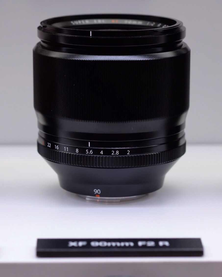
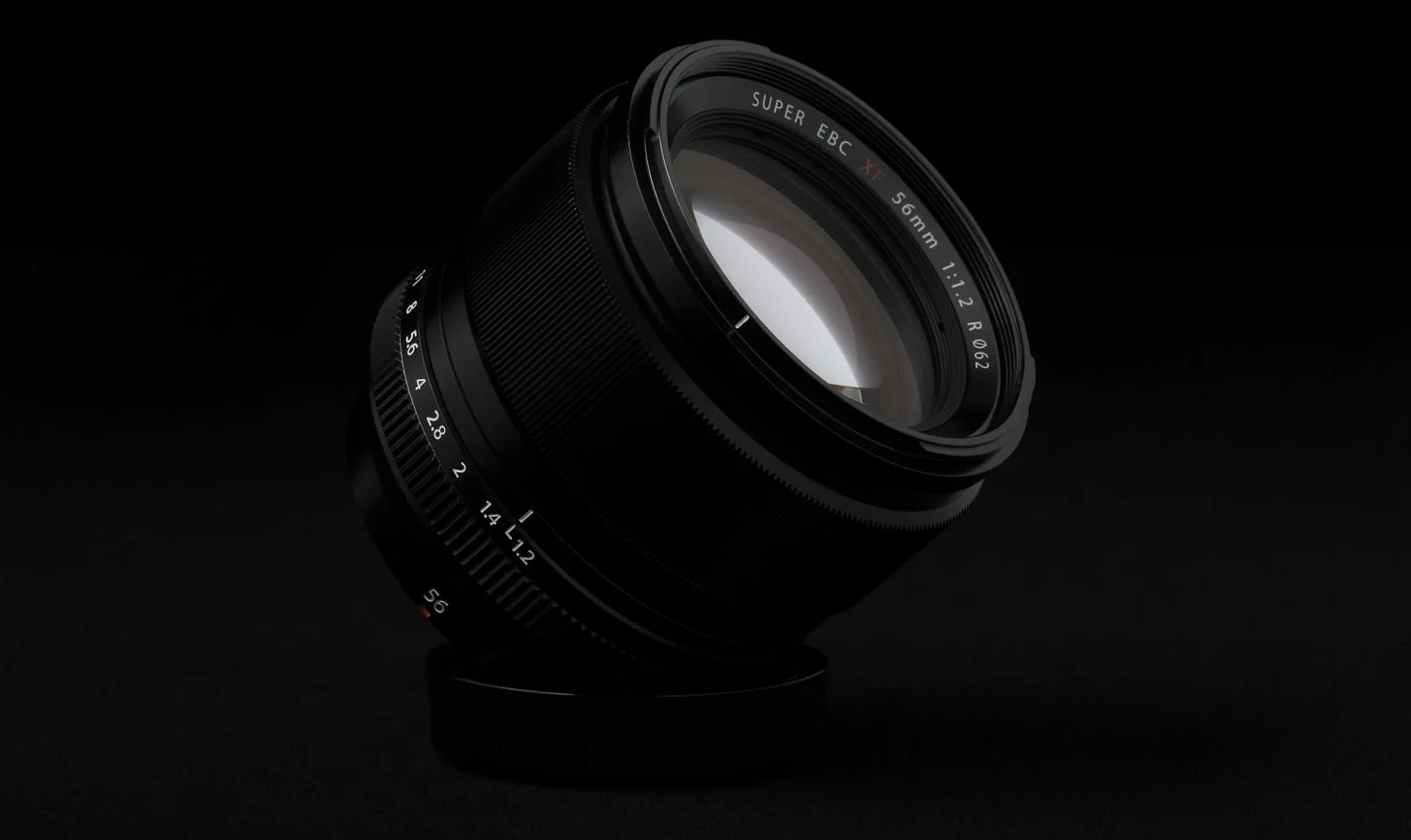
The 90mm f/2 was on display, behind glass, and sort of tucked away. It is one hefty-looking piece of glass. That lens looks to be around the same length as the 56mm f/1.2, but considerably thicker.

EDIT: After a second viewing, the clear the 90mm is going to be substantially larger. It’s pretty much a proportionally scaled up version of the 56.

I’m looking forward to that lens, but I have a feeling it will really call for the VG-XT1.


Fuji Fujifilm XF FUJINON 56mm f1.2 APD 90mm f2.jpg
Fuji Fujifilm XF FUJINON 90mm f2.jpg

Super Tele-Photo Zoom 140-400mm f/4-5.6

Another one behind the glass, but some preliminary specs were revealed. The lens markings say 140-400mm f/4-5.6. I’m told that’s not quite final yet though. The lens is another thick one—this is Fuji’s sumo year I think—but the prototype doesn’t appear longer than the 50-140mm. There is quite a range on it, but I hope they find a way to make it an f/4 constant. There’s something about variable apertures I’m just not into.

Fuji Fujifilm XF FUJINON 140-400mm f4-5.6.jpg
Fuji Fujifilm XF FUJINON 50-140mm 140-400mm f4-5.6.jpg

16-55mm f/2.8

And finally, Fuji’s standard zoom is still behind glass. This is one A lot of people are most eager for and sadly the release date slipped, but I’d rather they get it right rather than rush it out. Here are some more comparison images. It’s surprising how much larger this lens is compared to the 10-24mm f/4.

Fuji 16-55mm ƒ/2.8

Fuji 16-55mm ƒ/2.8

Fuji Fujifilm XF FUJINON 10-24mm f4 16-55mm f2.8 18-55mm f2.8-4.jpg

The 16mm f/1.4

This one was hiding on from me. I didn’t even realize it was behind the glass until the second day. As far as size goes, the 16mm f/1.4 doesn’t appear to be a great deal larger than the 14mm f/2.8, although I think Fuji maybe have been playing a trick on us as in the comparison image below, the 16mm is the only one that doesn’t have its rear cap attached.

Fuji Fujifilm XF FUJINON 16mm f/1.4.jpg

One thing that’s extra nice is the focus ring that’s pulled back for manual focus, that reveals the engraved depth of field markings.

Fuji Fujifilm XF FUJINON 16mm f/1.4.jpg

Patrick La Roque

After scoping out some other players, we made it back to the Fuji booth in time to see fellow Canadian, Patrick La Roque speak. Patrick is a super nice, down to earth dude whose work I really admire. He spoke about storytelling, and then did a live demo—models and all–that turned out really well.

Fuji Fujifilm Patrick La Roque Photokina.jpg

Other Players

I spent a lot of time checking out the other players of course, but one standout for my readers was Phase One. No joke, I was going to ask Phase One about any updates planned for Capture One when the email announcing version 8 landed on my inbox. Sadly, I couldn’t find anyone who spoke enough English to walk me through the new features, but I’ll try again tomorrow, and will look into updating my Raw Converter comparison once I’m back home.

That’s it for now!

I’ll be back for more tomorrow, but for the most part, I think one day at the show for consumers is plenty. I’m pretty happy to have just the one brand to cover.

Photokina Bound

photokina

Fuji vs. Fuji is headed to Photokina!

This year I am fortunate enough to be going to the big show. I hope to do a bit of live reporting from the show floor—and of course, the Fujifilm booth.

Afterwards, we’ll be extending our trip to a couple of weeks in Europe. As a result, Fuji vs. Fuji will be on a bit of a hiatus during that time, as we put our Fuji gear to good use.

Cologne, here we come!