Grips, ergonomics, and the E-M1
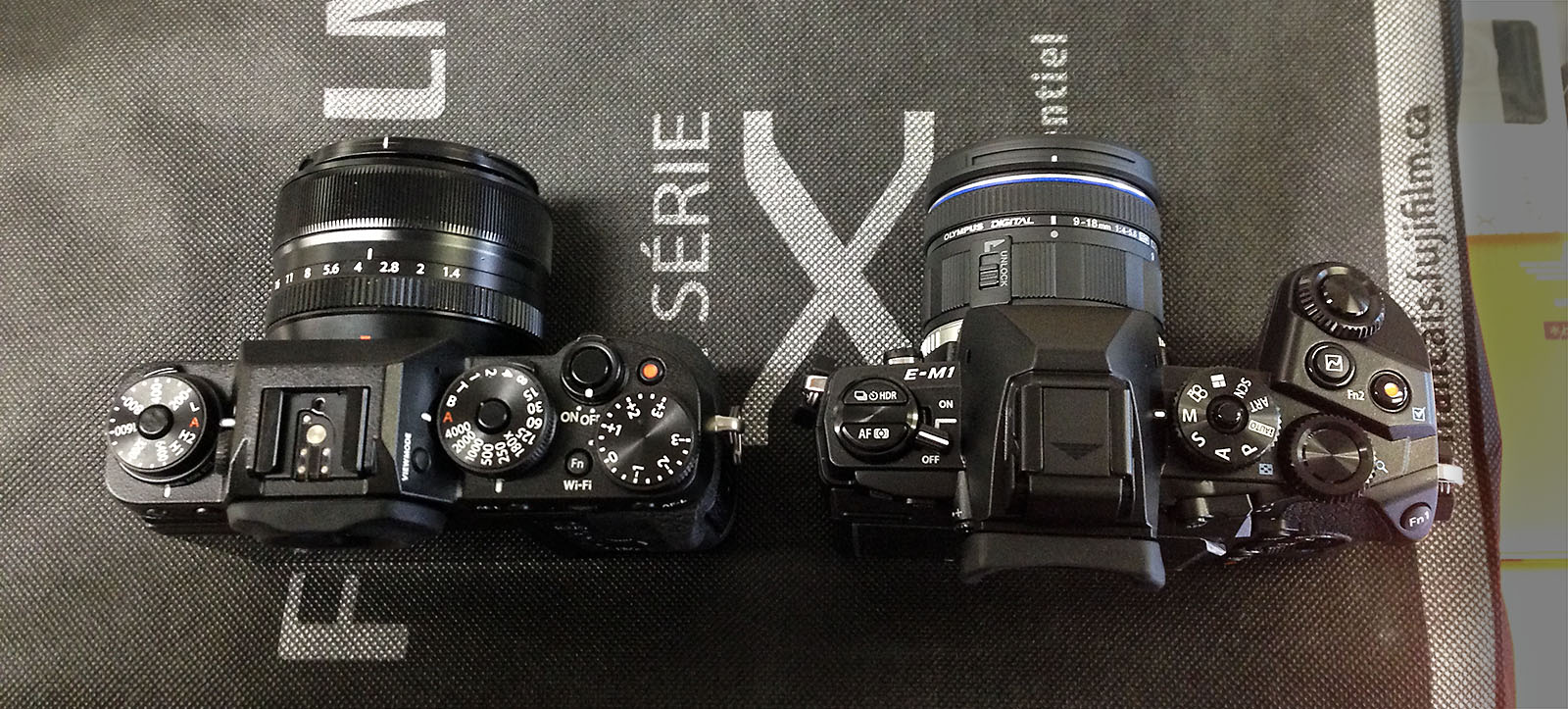
/With the X-T1 hitting the streets,1 a lot is being written about how it compares to the Olympus OM-D E-M1. I don’t own an E-M1, and I’ve done little more than try it out in the store, but I had an opportunity to directly compare the grips of the two cameras immediately after one another pretty extensively. Here are my findings.
My opinion on one-handed grip ergonomics in order of preference is:
- Olympus OM-D E-M1
- Fujifilm X-T1
- Fujifilm X-T1 with Fujifilm hand grip
Yep, the E-M1 comes out on top for me in grip comfort. One thing worth noting, I don’t have large hands. I suspect that most people with hands about my size and smaller would prefer the E-M1 because the grip fills the palm nicely. I’ve heard from people with larger hands that the grip protrudes too much for them.
One option excluded from the list is the X-T1 with the Vertical grip. As noted in my review of the X-T1, I actually prefer the ergonomics of the vertical grip, so it would be tied for first place with the E-M1. The X-T1 with Fujifilm’s Arca Swiss compatible handgrip is awkward for me. It adds too much, but folks with larger hands will really appreciate it, as seen below. For them, the grips adds just enough for all fingers to wrap comfortably around the camera.
On a decidedly less cerebral note, there’s no question the the X-T1 feels better than the Olympus. The camera is just somehow nicer to hold. It feels more premium. I’m not quite sure what to make of this as both bodies have magnesium alloy frames. Perhaps Fujifilm’s external material simply has a better feel to it.
Things change a little when you start trying to access all the buttons within range of your right hand. The E-M1’s “Multi Function” and “Record” buttons are perhaps the worst offenders. When I hold the camera comfortably, I can’t access those buttons without using my left hand to steady the camera while adjusting my grip to access those buttons.
The X-T1 simply does not have this problem. In fact, the only Fujifilm camera I’ve used that does is the X-E2 which has an AF point selection button that’s a little tough to access with the camera held comfortably or without moving it from your eye.2
Ergonomically, it will come down to preference. It’s an extremely subjective issue, but I believe there are ways of doing things that are just wrong. Sony’s A7(r) is a good example. Gripping that camera naturally results in having to pull your index finger uncomfortably to get to the shutter release, no matter what size your hand is. This leaves you with discomfort in your finger, or adjusting your grip more vertically to get the shutter release in line with your finger, which results in lots of hand/grip shimmying.
The last comment I’ll make on the whole X-T1 vs. E-M1 debate (in this post) is the glaringly obvious, yet superficial issue of appearances. Can there be anyone on the planet who thinks the E-M1 is a good-looking camera? As much as our rational minds tell us function trumps form, the reality is, fashion matters. I don’t think Fujifilm would be where they are today if the X100 and X-Pro1 didn’t look as good as they do.3 We all want a camera that looks cool to a degree. For some it matters less than others, but for me, the E-M1 is ugly enough that I wouldn’t want to own it as my primary camera. The good thing is, Fujifilm’s function is now keeping pace with their outstanding tastes in form. People who want a DSLR inspired compact can finally have the best of both worlds.
- Everywhere, but Canada it would seem. ↩
- Here’s hoping the next firmware update for the X-E2 lets us configure all Fn buttons like the X-T1 does. Shame about the labels, but nothing a little Sharpie action can’t fix. ↩
- Something they should keep in the very forefront of their minds as they conceive the X200 and X-Pro2. ↩
