The X-T1 is ready

There were a couple of issues that plagued the release of the X-T1. The first that most already know about, was the light leak. The second, slightly less well know is this, the directional pad of buttons (or D-pad) used for menu selection was mushy, somewhat unresponsive, and quite unsatisfying to use.

I want to state early in this post that for any of you who have been reading my thoughts and comparisons of the X-T1, and are concerned about the crummy buttons, you can now safely buy a new X-T1 that has a much better D-pad than those found on the pre-production units, and the the initial run of manufacturing.1 If you’re buying from a store, you can easily tell if you’ve got a good one through the plastic baggy that the camera ships in, so if the dealer is reluctant to crack the Fujifilm sticker-seal, it’s no problem. Just test the buttons through the bag. If the buttons click like this, you’re good. As we know the light leak issue has also been addressed, and clicky buttons also seem to indicate light tightness.

Taking responsibility

Fujifilm came forward pretty quick, acknowledged the light leak, and offered a fix for owners with afflicted cameras. With the D-pad, they have been pretty tight-lipped about the problem. I can only surmise this is because the earliest D-pads, while crappy, do technically work. They’ve also been somewhat cagey about whether or not rumours about X-T1’s going in for service for the light leak, and coming back with a better D-pad are true.2 I’ve heard from at least two other owners that cameras sent in for light leak repair—with the D-pad noted on the bill of service—have come back with the D-pad marked as having “no fault.” This was also my experience. Again, while technically true as the buttons can be considered as not having “fault,” and work as originally designed, the fact remains that manufacturing has been quietly adjusted. X-T1’s are hitting the streets in high quantity with substantially better buttons on their back sides. This isn’t luck of the draw.

The bad news

Unfortunately some early adopters are being left out in the cold. I actually went to the extreme of selling my launch X-T1 privately,3 and buying another. For many, this won’t be worth the loss on the retail price, but it was for me. I can now use my X-T1 without mild feelings of contempt.

The good news

A silent tweak to manufacturing is better than no tweak at all, and that tweak means my biggest, and really only major gripe about the X-T1’s handling has now been addressed.

For those of you still waiting to place your order, now is the time. The more time I spend with this camera, the more I like it, and the more I feel it is the interchangeable Fuji body to own. I’m about to download and install the X-E2 firmware, but I’m confident the X-T1 will still be my primary body, rain or shine.

Fortunately, Fujifilm don’t have a history of releasing X-Series camera bodies with manufacturing issues like these. I don’t think we’re in a “wait and see” position when Fuji release their next camera (yet), but I’m hoping to see better QA with their next release.

  1. I’m not positive, but serial numbers of cameras with the poor D-pad seem to approximately coincide with up to and including the light leak range of serial numbers. Possibly a little beyond. For instance, my X-T1 that suffered both issues was had a starting serial number of 41A05. My new X-T1 is 41A09. My undestanding is ≥41A06 have no light leak.
  2. The official response I got was “Our technicians check all aspects of the camera.”
  3. For the record, I noted in my listing that it was a launch unit with a poor D-pad. Fortunately I was at least able to say it had no light leak.

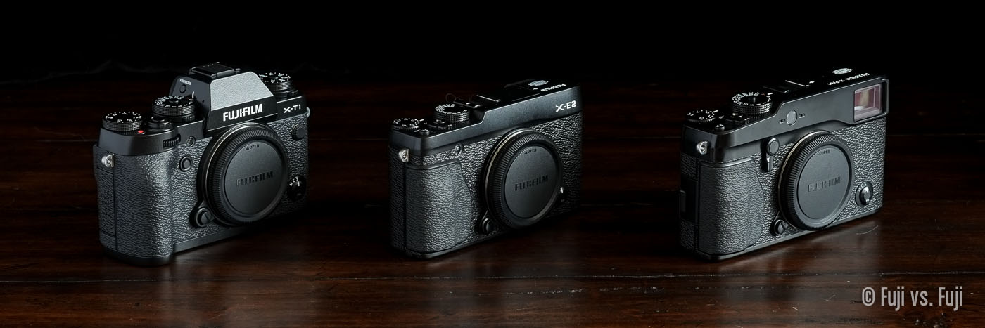
X-T1 vs. X-E2 vs. X-Pro1

Fuji Fujifilm X-T1 vs X-E2 vs X-Pro1.jpg

Another complete overhaul. This time, it’s my X-T1 vs. X-E2 vs. X-Pro1 page. It is still getting a remarkable amount of traffic, so I figured I would remove the rumour content. I didn’t stop there though. I’ve added a bunch of comparison images, and written up some impressions on how the overall handling of each compares to the others. I also cleaned up the table, which can still be found towards the bottom of the page.

What is perhaps most interesting about these three cameras now is how well the X-Pro1 still holds up, and how the X-E2 has faded away slightly. It’s still an extremely good camera, but it might be the overlooked middle child of the Fujifilm family these days.

X-T1 vs. X-E2 vs. X-Pro1

Adobe’s Fujifilm Camera Calibration Profiles

Another new page has been added to the “Extras” menu called Adobe’s Fujifilm Camera Calibration Profiles This will be another evolving oage. Currently it has just one images with each of the Fujifilm-endorsed profiles for a quick visual comparison, and brief analysis. This is pretty heavy duty pixel-peeping stuff, but it’s interesting nonetheless. I feel little shame in being picky about the end result of my images.

I’ll add the lake and valley image seen in my X-Trans Before & After page next so we can have a close look at how landscapes and greens are handled.

Adobe’s Fujifilm Camera Calibration Profiles Compared

Film Simulation Modes Compared

Fuji Fujifilm Film Simulation Modes Provia Astia Velvia PRO Neg Hi Std.jpg

A second subject has been added to my Film Simulation Mode comparison page. I figured the large areas of bright, bold colour against the deep shadows of the black background would make it very easy to see what’s happening between each mode.

More test subjects are yet to be added like a landscape, cityscape and a portrait, but I think next on the agenda is comparing Adobe’s Camera Calibration profiles with the in-camera rendering of each Film Simulation Mode.

Film Simulation Modes Compared

FUJINON XF 14mm f/2.8 Review Posted

My review of the XF 14mm F2.8 has been posted. I intend to keep my individual lens reviews about making images, and less about pixel peeping. They’ll includes real world samples to help give an idea of the kinds of images that can be made with the lens.

This is not to suggest my images are of outstanding quality. Some I’m pretty proud of, while others are included to illustrate the diverse capabilities of the lens.

The 14mm f/2.8 is a fantastic lens. Find out of it’s the wide-angle lens for you in my review.

On Adobe, and Lightroom for iPad

Today marked the release of Lightroom 5.4 which delivers the long awaited Fujifilm X-T1 support, and Film Simulation Modes for RAFs via the Camera Calibration panel. Awesome stuff. I plan to throughly analyze their profiles and compare them with their in-camera counterparts as soon as possible.

Today also marked Adobe’s announcement (or confirmation) that Lightroom will be available on the iPad for Creative Cloud subscribers only. This comes as little surprise, and yet I can’t help wondering what the hell they are thinking. It seems to me they are leaving money and users on the table by choosing (or sticking with) a pricing model they hope will encourage Creative Cloud subscriptions.

At the end of 2013, Adobe announced 1.4 million subscribers to Creative Cloud. That’s 1.4 million + people who will get Lightroom for iPad “for free.”1 Maybe Lightroom on iPad will keep some of those subscribers loyal,2 maybe some people will begrudgingly subscribe in order to get it.3 I won’t, and I think they’ve passed up an app pricing structure that would make them more money, make their customers happier, and be more future-proof. I’ve been pondering this morning about what that might be. One idea involves the dreaded in-app purchase (IAP).

“This app offers in-app purchases”

It’s not uncommon for top-tier apps on iPad to sell for $19.99. Twenty bucks is a fair price for an app like Lightroom, but that could be cut down to $15, $10, or even $0 because camera and lens profiles would cost anywhere from $1 - $5 each.

Done.

Things could be kept simple ($5/camera, $1/lens), but there’s tremendous flexibility in this pricing structure too. “Consumer” gear could be less expensive, “Pro” gear more expensive. Exotics or lenses with complex distortion correction profiles could also command a premium.

How many Creative Cloud subscriptions does Adobe realistically hope to gain making Lightroom for iPad subscription-only? Compare that number with how many photographers would happily shell out for Lightroom as a standalone application while being able to purchase camera and lens profiles as they see fit? I’d have happily paid Adobe $5 for the Film Simulation Modes they released for Fujifilm cameras today. Don’t want or need ’em? Then you’ve got the built-in Adobe profile already. The nice thing about Fujifilm is those same profiles would work across every camera that shares the X-Trans sensor, but let’s get back to Adobe for this post.

This model gives customers the freedom to purchase what they want, and more importantly what they actually need, something Creative Cloud fails at miserably. It’s also self-sustaining since we photographers can be a fickle bunch, generally speaking, many of us collect lenses, and we love our upgrades. Maybe Adobe would only ever get $7 less Apple’s cut from some photographers, but 70% of $7 is better than 100% of nothing.

I’d upgrade to a 128GB iPad just to have this imaginary version of Lightroom with me when I go on vacation. It would be an immediate backup of my photos to the iPad I’d have with me anyway, and I could start the selecting, rejecting, and editing process while still on vacation or on the flight home. I could see a lot of photographers doing the same for jobs.

What about Lightroom for the desktop?

Maybe it’s time the desktop version moves to a pricing structure like this one too with a reduced core applicaiton price. I’m personally not a fan having 100’s of MB of profiles I don’t need on my computer, and if DxO can implement a decent profile download system, Adobe sure can. We’d just have to hope they wouldn’t build it in Flash.

Of course the pay once and get everything model we’ve enjoyed to date with the desktop version of Lightroom would be ideal, but I’m trying to see this somewhat from Adobe’s side, and acknowledge that additional and recurring revenue might be a necessity.

The future of photography?

Perhaps most importantly of all, it protects Adobe from a potentially huge threat from Apple. Not strictly from Aperture, but from the iPhone. With any luck, Aperture for iPad is on its way. Maybe it will be announced alongside the iPhone 6 which presumably will feature an even better built-in camera. Now consider the iPhone 6 (or even a simple iOS update) allows owners to capture and manipulate RAW data with immediate support for it via the newly released Aperture. Given Apple’s track record these days, Aperture would be free. Now you’ve got the most popular camera on the planet’s RAW files editable via Apple’s competitively-priced one-time fee (or free) iPad app, and Adobe’s subscription-only app, once they get around to supporting the iPhone’s RAW files. Or, Adobe could just sell the iPhone profile for $2 to a ton of “iPhoneographers” who want to keep using Lightroom on the desktop.4

Apple isn’t known to add complexity the way adding RAW support certainly would. However, they are heavily focused on the photography market in general, and it seems there should be a very easy way to make RAW data available to users who want it via Aperture for iOS and the Mac, while keeping those who aren’t interested blissfully unaware. If photography continues to be an area Apple hopes to dominate, RAW support of some kind ought to be in their future. Just imagine all those VSCO presets being applied to sensor data rather than JPEGs.

Conclusion

I can’t be totally sure the pricing structure I outlined above would work, or if it would ultimately even be profitable after the content delivery system is in place. It’s really just musing with some griping for good measure. What I do know is Adobe’s actions are getting frustrating, and are starting to reek of hubris. I’m curious what it would take for them to wake up. Extraordinary apps like Pixelmator are already putting a dent in the once invincible Photoshop. If I wasn’t so deeply entrenched in the industry I am (advertising, marketing, etc.), I’d have dumped Photoshop for Pixelmator already.

Adobe’s apps have become uncontrollably bloated and hopelessly inconsistent. Lightroom was widely regarded as they only app they were still “getting right.” I think that sentiment will change with photographers to some degree today, and that’s a shame.

  1. Anyone who believes this needs to reassess their definition of “free.”
  2. I doubt this number is very high. Most people who subscribe do so out of necessity.
  3. This number is probably even lower.
  4. Or on Windows for that matter.

Fujifilm X-Trans: Before & After

I’ve added a new page under “Extras” in the main navigation for “X-Trans Before & After.” It will be an ever-evolving page showing quick screen grabs of RAFs and JPEGs with the “Before / After” view mode active in Lightroom to show just how much dynamic range can be pulled out of the X-Trans sensor, and how much JPEGs can be altered in post.

I’ll maintain this page until DxO figures out how to run their tests on X-Trans sensors. ;-)

X-Trans Before & After

Cable Releases

A few months ago I purchased three different cable releases from B&H, the Gepe GE2020 Cloth Covered Cable Release w/Disc-Lock 20", the Nikon AR-3 Threaded Cable Release, and the Pentax PECR50 Cable Release 50. I had intended to write up a comparison of the three releases, but it’s been on the back burner for the last little while. However, yesterday this happened:

 Gepe GE2020 Cloth Covered Cable Release w/Disc-Lock 20"

 Gepe GE2020 Cloth Covered Cable Release w/Disc-Lock 20"

That’s the Gepe GE2020. The entire plunging mechanism decided to liberate itself from the rest of the cable, and it doesn’t simply just pop back on as far as I can tell. This release has hardly seen any use—I’ve only had it for a few months—and it’s never even left the comfort of my warm home.

Because of the malfunction, the Gepe GE2020 gets my lowest rating of the three by default. Coincidentally, it would have been the release I recommended least anyhow. It’s plunger is significantly smaller than the Nikon and the Pentax, and the plunging action is actually noticeably rougher than the others.

The larger plunger on the Pentax PECR50

The larger plunger on the Pentax PECR50

The Pentax and the Nikon are both fantastic. I’m pretty sure they’re just rebranded as they are identical with the exception being the Pentax is 20 inches and the Nikon, just 12 inches. I prefer the extra length of the Pentax, but I keep the Nikon in my Billingham because it’s shorter.

The Pentax PECR50 and the Nikon AR-3 are identical aside from length

The Pentax PECR50 and the Nikon AR-3 are identical aside from length

So there you have it, between the three, I can recommend either Pentax or the Nikon. Decide which length is better for you. I recommend against the Gepe entirely. Not only is it lacking in the durability department, it wasn’t as nice to use either. The Pentax and the Nikon have significantly smoother operation. There are plenty of other options out there, but either the Nikon AR-3 Threaded Cable Release, and the Pentax PECR50 Cable Release 50 suit me fine.